Stamp Perforation Types, and How to Choose Yours
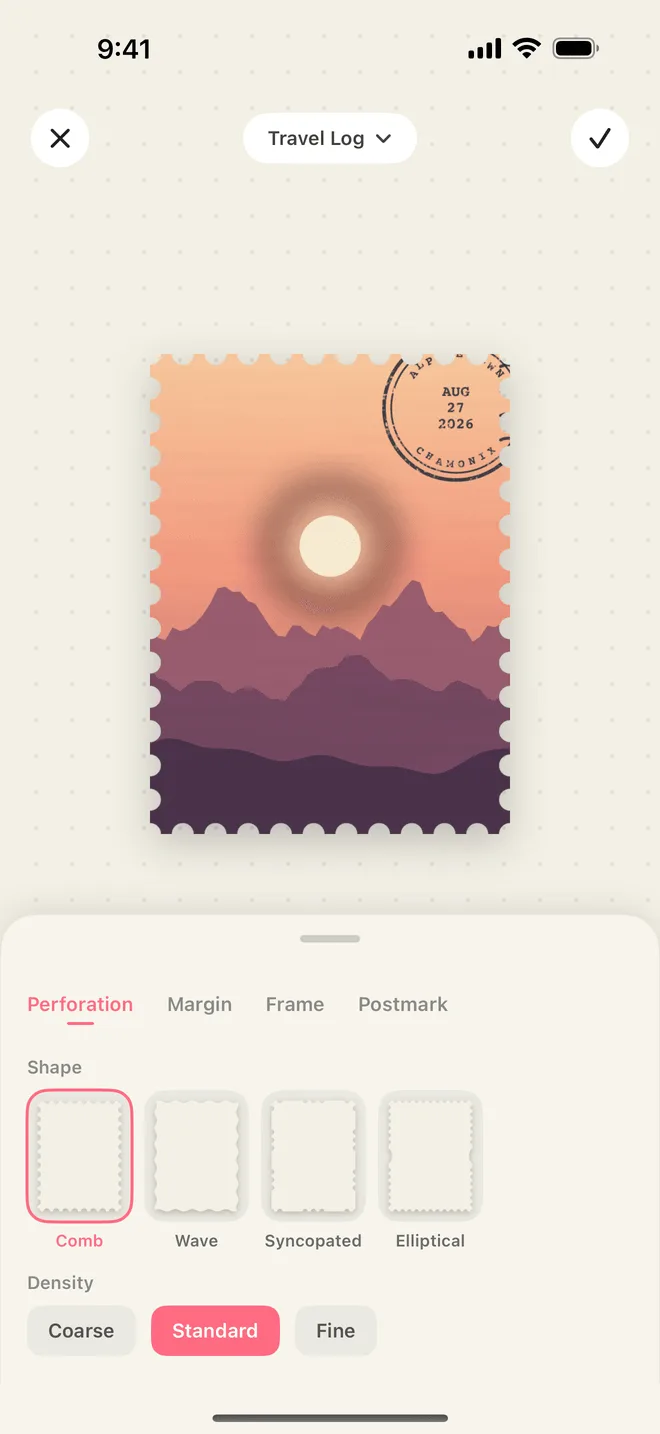
A photograph has edges. A stamp has teeth. That difference is most of what makes the same picture read as postage, not a snapshot, and it is why the perforation is the first thing InStamp asks about after the crop.
What is surprising is that nobody regulates those teeth. The Universal Postal Convention defines what a postage stamp is — issued under a postal authority, carrying the issuing country in Roman letters and a face value — and says nothing about holes. Its one nearly physical rule is that a country trying a new material or technique must tell the UPU whether the result still runs through mail-processing machines. The edge has always been the printer’s own decision.
Why stamps have holes at all
The first one didn’t. The Penny Black of 1840 was printed in sheets and cut apart with scissors, as were all British stamps until 1854. Henry Archer spent 1847 and 1848 building machines to do the job properly — one that slit the paper, then one that punched holes out of it. The Treasury bought his patent in 1853 for £4,000, and in 1854 the Penny Red became the first officially issued perforated stamp. Japan’s first stamps, in 1871, were imperforate too; perforated issues began there the following year.
Printers learned the trade-off immediately. Those 1854 sheets were punched at gauge 16 — so many holes that sheets broke apart on their own — and soon dropped to 14. Too fine and the paper tears itself; too coarse and it won’t tear where you want it to. Clean separation is a balance between how big the holes are and how many of them there are, which is the choice InStamp hands you as three densities.
How a perforation is measured
Since 1866 there has been a unit. Jacques-Amable Legrand, a French physician and philatelist, defined the gauge as the number of holes in 20mm and made the little measuring card that reads it off, which he named the odontomètre — a tooth-measurer. Catalogues still write it his way: P13, or P13.5×13 when the horizontal and vertical edges are punched at different rates, which they very often are.
Scott, Stanley Gibbons and Michel give the same design separate catalogue numbers at different gauges — Scott usually to a quarter of a unit — though a real gauge often disagrees: one British definitive listed as 15×14 measures 14¾×13¾. China wrote the number into regulation, requiring a new-issue announcement to disclose the perforation gauge along with the printing method and the security features. Values such as 13, or 13.5×13, are typical of Chinese commemoratives.
The arithmetic is easy: spacing equals 20mm divided by the gauge. Gauge 11 puts holes 1.82mm apart, 13 gives 1.54mm, 14 gives 1.43mm, 16 gives 1.25mm. Classic and modern stamps mostly live between 11 and 14 — finer than almost anyone draws them from memory.
Line, comb and harrow: read the corners
Three ways to punch a sheet, separated by how much one strike covers.
Line perforation lays down one row of pins at a time: all the horizontal lines first, then the sheet turns ninety degrees for the verticals — twenty-two separate strikes for a sheet of ten by ten. The rows cross each other irregularly, so corners come out overlapped, doubled or cut short, and stamps from one sheet differ slightly in size. That is the nineteenth-century edge.
Comb perforation uses a comb-shaped head that punches three sides of a row of stamps at once — one horizontal edge and a segment of both verticals — then advances a row. Tooth counts stay constant and the corners are all equal and regular, exactly one hole at each. Most twentieth-century gummed stamps are combed.
Harrow perforation punches the whole sheet in one strike, so its corners are the most consistent of all: a stamp with irregular corners cannot have been harrow perforated.
To guess a stamp’s age from its edge, look at the corners rather than the teeth.
The odd holes: syncopation and the security ellipse
Syncopated perforation leaves holes out on purpose. The earliest case is Dutch: the roltanding coil stamps of 1925 to 1933, sold from vending machines, omitted certain holes to a fixed pattern — types A, B and C — so the strip would not tear off as it was pulled. The gaps leave long uncut stretches, and give the edge a rhythm.
The ellipse is younger and more calculating. From 1993, British Machin definitives carry one large elliptical hole set into each vertical edge, put there to make forgery harder, and it has been standard on British definitives ever since. From 2009 the self-adhesive Machins went further, with four U-shaped slits cut inside the design, so a stamp peeled off an envelope to be reused destroys itself.
Self-adhesives explain the last shape. Nothing about them needs tearing, so their teeth are a continuous wave cut by a die — a simulated perforation, still measured in gauge and published as a serpentine die cut, kept for no reason except that a stamp without teeth doesn’t look like a stamp.
The four styles in InStamp
Each style is one of those traditions.
Comb is the workhorse: even teeth, one hole at every corner, the edge most gummed stamps of the last century wear. It flatters nearly any photograph, and it is the one to reach for when you want an official-issue look — portraits, buildings, landscapes.
Wave is the self-adhesive edge: a smooth continuous curve, cut rather than torn, with no ragged fibres. It reads modern and clean, and suits bright, graphic pictures — food, objects on a plain ground, strong flat colour.
Syncopated is the coil-stamp rhythm, holes skipped to a pattern so the edge has long teeth and short ones. Use it when you want the edge itself noticed: the cover stamp of a collection, or one picture standing apart from a set.
Security ellipse is comb teeth with the 1993 Machin trick added, an ellipse in each side edge. It is the most official-looking of the four, and does something quietly nice for tickets, documents and street signs — photographs already about print.
All four come at three densities, and nothing is permanent: every stamp keeps its original photo, so you can punch it again whenever you change your mind.
Densities, and a rule of thumb
Density is the same balance the Victorian printers were weighing, minus the risk of the sheet falling apart. The finest setting takes small, shallow bites and reads as printing — closest to the 11-to-14 range real stamps live in, and the kindest to photographs with detail near the edge. The coarsest takes big bites and reads as handwork: bolder, more toy-like, and far more legible when the stamp is small.
If you would rather not think about it, comb at the middle density is right for almost every photo. After that, coarsen the teeth on anything with a big simple subject, keep them fine on anything delicate, and save the ellipse and the skipped holes for the stamps you want people to look at twice. The rest of the flow, from cropping to postmarking, is in Turn a photo into a stamp; the editor itself is on the InStamp home page.